Tips for Choosing Calm Colors to Create a Relaxing Home
Creating a soothing atmosphere in your home starts with the colors you choose for your walls and decor. Calm colors can transform a space by evoking feelings of peace, relaxation, and balance. Whether you want your living room to be a restful retreat, your bedroom to promote restful sleep, or a kitchen that feels welcoming and serene, selecting the right hues is key. In this post, we’ll explore practical tips to help you choose calm colors that suit your style and space.
Why Choose Calm Colors?
Calm colors tend to be soft, muted, or cool tones that are easy on the eyes. Unlike bright or bold colors, calm shades encourage relaxation and reduce visual noise. They are popular in spaces where you want to unwind, focus, or foster calm social interactions.
Examples of calm colors include:
– Soft blues and greens
– Pale gray tones
– Warm beiges and taupes
– Gentle lavender or dusty pink
Step 1: Consider the Purpose of Each Room
Before picking a color, think about how you use each room. The right calm color depends on the room’s function.
For Bedrooms:
– Opt for soft blues, muted greens, or gentle lavenders to promote restful sleep.
– Avoid overly bright or highly saturated colors that may feel stimulating.
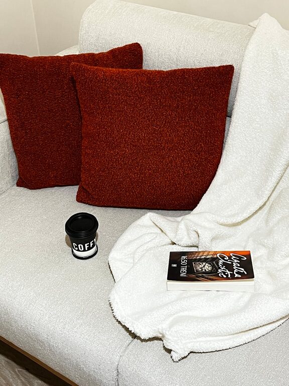
For Living Rooms:
– Choose warm neutrals like beige, pale gray, or soft taupe to create a cozy yet calm environment.
– Incorporate calming accent colors through pillows or artwork.
For Home Offices:
– Cool tones like greens or light blues can improve focus and reduce eye strain.
– Balance with neutral shades for a professional, uncluttered feel.
Step 2: Use the Color Wheel Basics
Understanding basic color relationships helps create harmony.
– Analogous colors: Colors next to each other on the wheel (like soft blue and seafoam green) blend well and feel tranquil.
– Monochromatic schemes: Using different shades of the same color (e.g., pale blue, dusty blue, navy) adds depth while keeping the calm mood.
– Avoid stark contrasts: High contrast or clashing colors can break the peaceful vibe.
Step 3: Test Colors in Natural and Artificial Light
Colors can look different depending on lighting.
– Test paint samples on your walls during different times of the day.
– Observe how sunlight affects the hue in the morning vs. evening.
– Consider the warmth of your artificial lights; warm bulbs can soften cool colors and vice versa.
Step 4: Choose Matte or Satin Finishes
Glossy or high-shine paints tend to reflect more light and draw attention, which might be less calming.
– Matte or satin finishes absorb light gently and create a soft, inviting feel.
– They are great for bedrooms, living rooms, and other relaxation spaces.
Step 5: Incorporate Textures and Accents
Color is important, but so is the texture.
– Soft fabrics like linen, cotton, or wool add warmth and comfort.
– Natural materials such as wood, stone, or wicker complement calm color palettes.
– Subtle patterned curtains or cushions can add interest without overwhelming the calm atmosphere.
Step 6: Use White and Neutrals to Balance
Neutral tones like white, cream, or soft gray provide a clean backdrop that highlights calm colors.
– These shades can help open and brighten spaces, making them feel more spacious.
– Pairing gentle accent colors against neutral walls maintains tranquility.
Step 7: Don’t Be Afraid to Personalize
While calm colors have common traits, what feels soothing for one person may differ for another.
– Consider your personal preferences and what makes you feel relaxed.
– Create mood boards or collect samples from magazines and paint stores.
– Feel free to add small pops of color that bring joy without disturbing the overall calm.
Final Thoughts
Choosing calm colors for your home is a thoughtful process that can greatly enhance your comfort and well-being. Start by reflecting on each room’s purpose, experiment with soft and muted shades, and observe how light interacts with your choices. Remember that calmness comes not only from color but from the harmonious combination of texture, finish, and decor. With these tips, you’ll be well on your way to creating a peaceful oasis in your home.
—
Did you enjoy these tips? Share your favorite calm colors and ideas in the comments below!